
Next.js 13.5: Exploring Features and Improvements

Next.js is an open-source JavaScript framework built using React. It helps web developers make user-friendly web applications and static websites. This renowned React framework has come with its latest version, Next.js 13.5. With each new version, Next.js is getting more powerful. Released on September 19, 2023, this new edition has taken the world by storm. Let us find out what is new about it. This blog explores the exciting Next.js 13.5 features and improvements. Fast Page Loading The latest version of Next.js supports quick page loading. Next.js 13.5 has optimized its core framework. Therefore, web applications load faster without compromising on user experience. The version 13.5 features built-in optimization for fonts, scripts, images, and application scripts. Image Improvements Next.js 13.5 comes with robust image optimization capabilities. In comparison to previous versions, Next.js 13.5 is better in image resizing and compression. As a result, you can deliver your images in a perfect size and format. In addition to this, the framework has added an experimental function unstable_getImgProps(). It supports different use cases without using the <Image> component. Now you can: Work with background-image or image-set. Use <picture> media queries to carry out Art Direction or Light/Dark mode images. Work with canvas context.drawImage() or new Image(). Moreover, now the placeholder prop provides support for arbitrary data: image/ for placeholder images. Improved Startup and Refresh Time Other Next.js 13.5 improvements that are worth mentioning include fast startups and refreshes. You can notice a significant improvement in refresh and startup time. The framework is now more reliable for App router applications. If you compare this new version with the previous Next.js 13.4, it is about 22% faster in local server startup and 29% quicker in HMR (Refresh). Apart from this, it uses about 40% less memory. Next.js 13.5 has optimized expensive file system operations and removed redundant blocking synchronous calls. Caching in Next.js Apps Caching has a crucial role in web application development. It has a direct impact on user experience and performance. Besides this, it minimizes the operation cost of the application by storing rendering work and data requests. Next.js 13.5 allows users to retrieve the stored version of web applications. Since users do not fetch data from scratch every time, they experience fast web loading. Next.js 13.5 supports numerous caching mechanisms. It makes it easier for developers to carry out client-side caching. Some prominent caching mechanisms in Next.js 13.5 include: Data Cache Data Cache is one of the vital Next.js 13.5 updates. It stores the results of different data fetches across server requests and deployments. As a result, once data is fetched and stored, users can access it quickly in subsequent requests. Since the results are not coming from the source, it takes less time. Request Memoization This caching mechanism helps the server to remember the return values of functions. For instance, if the same data is being requested repeatedly in a React component tree, Next.js stores the data instead of fetching it over again. It is beneficial when the same data needs to be accessed. Full Route Cache As the name suggests, this mechanism caches the full HTML. Besides this, it also stores the React Server Component payload of a route on the server. It naturally minimizes the cost of rendering. Router Cache Next.js also stores the cache on the client’s side. It keeps the record of the React Server Component payload for every route segment. The router cache enhances the navigation experience by storing earlier visited routes and prefetching possible future routes. Improved Experience for Developer With the release of every Next.js version, the framework gets better in the developer experience. The developers can notice a noteworthy improvement in TypeScript support, documentation, and error messages. In addition to this, you get access to Next.js CLI. This tool helps you see updates for project setup and management. Metadata API Metadata API is a crucial addition to Next.js 13.5. With this Next.js 13.5 feature, you do not need to struggle with SEO metatags. Earlier, users had to create a file (head.js) to set the metatags for SEO. Next.js version 13.5 features a new way of handling static and dynamic metadata. You can export objects with static information. For dynamic data, you can export functions. This approach is more helpful for managing metadata efficiently. Stable App Router A stable app router is one of the prominent Next.js 13.5 benefits. Now you can use React server components, nested routes & layouts, and simplified data fetching confidently. These updated server components will help you build apps faster. Conclusion It is imperative to stay informed with the evolving world of web development and its latest technologies. Today, Next.js is a keystone of react-based web development. With Next.js 13.5, you enjoy a range of new features and improvements. Whether it is a developer experience, performance, or security, Next.js 13.5 can keep you ahead in the competitive web development world.
What’s New in Vue 3.3? Explore the Differences

Vue.js is a renowned JavaScript framework that helps web developers build UIs (User interfaces) and SPAs (Single-page applications). This open-source JavaScript library undergoes updates from time to time. It has released various versions so far. Lately, on May 11, 2023, Vue announced its new version, i.e., Vue 3.3. Numerous developers are keen to learn what’s new in Vue 3.3. If you’re one of them, here is the comprehensive guide. Vue 3.3 Updates Vue is evolving fast, and with each new version, it brings a lot of improvements. In version Vue 3.3, you will notice the following features and enhancements. 1. Improvements in TypeScript TypeSupport Improvement in TypeScript is one of the significant improvements in Vue.js 3.3. It helps users write type-safe in Vue applications. Earlier, they could use only local types like type literals and interfaces in the type parameter position of the defineProps and defineEmits compiler macros. With Vue 3.3 updates, this issue has been resolved. The Vue compiler is now capable of handling both imported types and a limited set of complex types. The type interface for reactive properties is more accurate in this new version of Vue. It naturally minimizes the possibility of type-related errors. <script setup lang="ts"> import type { Props } from './foo' // imported + intersection type defineProps<Props & { extraProp?: string }>() </script> 2. Support for Different Data Types Vue 3.3 features a plethora of improvements. One significant among them is support for different data types. It gives you support for generic components. Now users can easily make reusable components that work with various data types smoothly. This feature is highly beneficial for those developing components that deal with varying data types. What makes it better is users can do this without compromising on safety. 3. Suspense Vue 3.3 has introduced the Suspense feature, allowing the users to handle asynchronous operation seamlessly in the components. The user can define fallback content to display while waiting for data to load. The suspense feature of Vue 3.3 can significantly improve your user experience, especially when your component needs to fetch data from an API. <template> <Suspense> <template #default> <AsyncComponent /> </template> <template #fallback> <LoadingSpinner /> </template> </Suspense> </template> 4. Improved Syntax for defineEmits Another notable improvement you can see in this latest version of Vue.js is enhanced syntax for the defineEmits function. It enables you to declare the events that a component releases. The function improves the readability of code and lets you define Emits with an object notation. It helps users to make a better representation of the emitted events inside the component. <script> import { defineEmits } from 'vue'; export default { emits: defineEmits(['click', 'input']), }; </script> In the above code snippet, the ‘emits’ property utilizes the ‘defineEmits’ function in conjunction with an array having event names. This approach guarantees a concise declaration of the component’s emitted events. Therefore, it enhances the readability of the code. 5. defineModel: Streamlining Two-way Binding Components The innovative defineModel function introduced in Vue 3.3 makes it easy to create two-way binding components. It provides a user-friendly method for defining the modelValue prop and update:modelValue event. Generally, it is used in v-model bindings. 6. Easy Access to Reactive Props Vue 3.3 has simplified the access to reactive props inside a component’s setup function. This improvement streamlines the process of managing props, supporting easy writing and reading of code and conciseness. <script> import { reactive } from 'vue'; export default { props: { user: Object, }, setup(props) { const { user } = props; // Destructuring reactive props // Utilizing the destructured user object console.log(user.name); // … }, }; </script> The provided code snippet destructures the user prop within the setup function. It allows direct access to its properties. It helps in simplifying the code readability. 7. Improvements in Devtools Devtools in Vue 3.3 have undergone various improvements. Some of the major updates are as per below. Event Inspector The Event Inspector in Vue 3.3 gives better insights into the event system of applications. It lets you inspect event listeners and find out which components are listening to particular events. Pinning Components You can now “pin” components in Vue. As a result, it is easier to keep track of a particular component while steering through an application’s component tree. 8. Type Slots with defineSlots Vue 3.3 features an innovative function named defineSlots. As the name indicates, it encourages precise specification of slot types within a component. This feature boosts type safety in components. Furthermore, it improves IDE support for slot content. <template> <div> <slot name="header" :data="headerData" /> <slot :data="defaultData" /> </div> </template> <script> import { defineSlots } from 'vue'; export default { slots: defineSlots({ header: { data: { type: Object, required: true, }, }, default: { data: { type: String, required: false, default: 'Default Slot Content', }, }, }), }; </script> In the above code snippet, the slots use the defineSlots function to define the type of slots used in the component. It helps developers to do type-checking and relish autocompletion during leveraging slots. Conclusion In the ever-involving world of web development, it is necessary to keep pace with cutting-edge innovations. What’s new in Vue 3.3 is worth exploring for web developers. Vue.js has been constantly improving to empower users and provide them with a better experience. The Vue 3.3 updates have brought substantial improvement in TypeScript support and APIs. You can definitely consider using Vue 3.3 for your next project. Unlock the boundless opportunities with Vue 3.3. These are a few major updates in Vue 3.3. For complete details, you can refer to Vue 3.3 release notes.
Qwik Framework — Symbolizing Resumability & Serialization

An efficient JavaScript framework can build a road to success in your front-end development. Well, we live in a furiously innovative world with a variety of JavaScript Frameworks outperforming each other. But the Qwik stands out as a blazing fast yet developer-friendly framework designed to streamline your development process. Thanks to resumability and lazy loading, Qwik is 5-10 times faster than all the existing JavaScript frameworks. Meanwhile, its productive features and convenience to use craft a perfect environment for complex front-end development. Since there’s a lot to cover about Qwik, we have incorporated everything you need to know in this guide. Let’s start with understanding the framework itself and there’s a lot more waiting for you in the queue! What is Qwik? — A Solution to Developer Problems! Developed by the creator of Angular, Qwik is an open-source frontend framework known for offering super-fast page load speed and efficiency. It delivers HTML with minified JavaScript featuring the necessary elements only for an incredible performance. Thanks to its fine-grained architecture, Qwik can isolate the segments and hydrate them so that they can be used whenever required. The framework has reached a new potential with the v1.0 update offering better optimized rendering time and features like Lazy execution. Generally, developers need to incorporate a glut of JavaScript to make a website interactive. Qwik allows you to conduct the same level of development with efficient execution and trimmed JavaScript. Therefore, it gets you rid of slow loading times, network consumption, and compromised startup times. How Qwik is Overtaking Other Frameworks? Ultimate User Experience What do you expect from a framework that enables you to build a lightning-fast website? First and foremost, an amazing user experience out of the box! With JavaScript streaming, Qwik delivers digital products optimized for CWV scores regardless of the complexity of your project. Also, the framework works with Data Fetching that prevents waterfall delays and sustains the performance even on devices with unstable networks. Integrations Despite using a minified code, Qwik can still make your website highly capable with its exclusive integrations. You can write your application in a hosting provider and deploy it in various adaptors from Azure Cloudflare to Google Cloud Run. Additionally, Qwik supports UI components and libraries including QwikUI, Papanasi UI, Material UI, ChakraUI, and Radix. All this with just a command “npx quik add” and Qwik will give you access to a complete list to hunt for integrations. Interoperability Nothing can compete with Qwik when it comes to interoperability or just say communications between the devices. You have Qwik-React designed for lazy hydrating the React components to speed up your React application. The framework allows you to leverage the React ecosystem and migrate it over to Qwik for ultimate interoperability. Productive Developer Experience Not only does it ensure optimum user experience, but Qwik also unlocks a productive development environment for the developers. The framework features Directory-Based Routing and Middleware Logic ensuring convenient website creation and deployment. Moreover, its familiar JSX and unified execution model bolsters both front-end and back-end development in a single application codebase. Even if you’re looking to pin functions specifically to a server or browser, you can do it easily with “server$()”. Community of Passionate Developers Qwik is a globally connected framework with an exclusive community of developers from all around the world. The motivating and supportive community always appreciates sharing ideas and pushing the boundaries of the framework’s potential. Not to mention, the Discord community is evolving and community members are always available to answer your questions and resolve your queries. Whether it’s a bug or a general query, you can quickly reach out to the community and enjoy an unmatched development experience. Understanding Resumability & Lazy Loading Resumability: Enhancing Application Efficiency Resumability is a powerful feature allowing a program to pause its execution at a specific point and later resume from that point. Resumability enables developers to optimize resource utilization. This is particularly beneficial in scenarios where long-running operations or resource-intensive tasks are involved. With the Qwik Framework, developers can leverage resumability to create more robust and responsive applications. Qwik provides mechanisms that enable the serialization of the application state, allowing for seamless pausing and resuming of execution. This empowers developers to build applications that can handle interruptions, such as network failures or user interactions, with grace. By symbolizing resumability, the Qwik Framework ensures that developers can create applications that are not only efficient but also resilient to various disruptions. Lazy Loading: Improving Performance through On-Demand Loading Lazy loading is a technique that enhances application performance by deferring the loading of certain resources until they are needed. Instead of loading all resources upfront, lazy loading enables the on-demand loading of data, components, or modules when they are required during runtime. Qwik Framework leverages lazy loading to optimize application performance. By splitting an application into smaller, independently loadable units, Qwik allows loading of only the necessary components when needed. This approach reduces the initial load time of an application and improves its responsiveness. Additionally, lazy loading can also save bandwidth and reduce memory usage, making it particularly useful for large-scale applications or those accessed over slower network connections. Conclusion: All right! Here you have industry’s most efficient JavaScript framework that is 10x faster than its alternatives. As discussed above, Qwik can split the application into independent units that only load whenever required. Similarly, the framework can isolate the segments and hydrate them to offer blazing-fast load speed and optimize the site performance. Especially if you’re working with Qwik v1.0, you can unlock all the features that we have discussed above. Whether you are an enterprise or just working on a complex project, an experienced developer is always worthwhile. Having a professional Qwik developer at your side makes the development more productive and gets you the best out of your investment.
Angular v16 — An Ultimate Game Changer
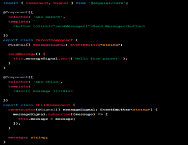
Angular, the popular JavaScript framework, has been continuously evolving to meet the demands of modern web development. With each major release, Angular brings new features, enhancements, and optimizations. Angular v16 is no exception, and it introduces several groundbreaking changes that make it an ultimate game changer for developers. In this article, we will explore the top new inclusions and exclusions in Angular v16 and discuss how they revolutionize the development experience. So, let’s get started! What’s New in Angular v16? — Top New Inclusions and Exclusions Binding router Information to Component Inputs First and foremost, Angular v16 allows you to bind router information to component inputs to eliminate boilerplate code during development. You can access the router data including resolved router data, params, and queryParams without using ActivatedRoute. That’s because this new feature gets the router data available as input in the component itself. So, you can use those inputs to fetch the values instead of messing up with ActivatedRoute. Here’s an example: // Current approach, which would still work @Component({ … }) class SomeComponent { route = inject(ActivatedRoute); data = this.route.snapshot.data['dataKey']; params = this.route.snapshot.params['paramKey'] } //New approach @Component({ … }) class SomeComponent { @Input() dataKey: string; @Input() paramKey: string; //or @Input() set dataKey(value: string){ //react to the value }; @Input() set paramKey(value: string){ //react to the value }; } Angular Signals Angular Signals is a new feature in Angular v16 that enables the communication between components using a publish-subscribe pattern. It allows components to emit signals and subscribe to signals emitted by other components. This feature promotes loose coupling and makes it easier to build modular and reusable components. import { Component, Signal } from '@angular/core'; @component ({ selector:'app-parent', template: ' <button (click)="sendieszage()*>Send Mezzage</button>' }) export class Parentcoponent { @Signa1() messagesignal: Eventemstter<string>; sendMessage() { this.messageSignal.emit('Hello from parent!'); } } @Component({ semprater: 'app-child', template: ' <div>{{ message }} </div>' }) export class ChildComponent { constructon(@signal() messageSignal: EventEmitter<string>){ messageSignal.subscribe((message) => { this: message = message; }); } message: string; } In this example, the `ParentComponent` emits a signal when the button is clicked, and the `ChildComponent` subscribes to that signal and displays the message. RxJS Interoperability Angular v16 brings improved interoperability with RxJS, making it easier to work with observables and leverage the power of reactive programming. The new `@rxjs` package provides decorators and utilities for integrating RxJS into Angular components seamlessly. For instance, you can use the `@rxjs/debounceTime` decorator to debounce user input in an Angular component: import { Component } from '@angular/core'; import { debounce } from '@rxjs/debounceTime'; @component ({ selector:'app-example', template: ' <input (input)="handleInput($event.target.value)"/>' }) export class ExampleComponent { @debounceTime(300) handleInput(value: string){ // Perform operations with debounced value } } The `@rxjs/debounceTime` decorator automatically applies the `debounceTime` operator to the `handleInput` method, simplifying the usage of RxJS operators within Angular components. DestroyRef Managing subscriptions and resources in Angular components can be a challenge. Angular v16 introduces the `DestroyRef` interface, which simplifies the cleanup process when a component is destroyed. By implementing the `DestroyRef` interface, you can automatically unsubscribe from subscriptions and perform cleanup tasks when the component is destroyed: import { Component, OnInit, OnDestroy } from '@angular/core'; import { Subscription } from '@rxjs'; import { DestroyReg } from '@angular/destroy-ref'; @Component ({ selector:'app-example', template: ' <p>Example Component</p>' }) export class ExampleComponent implements OnInit, OnDestroy, DestroyReg { private subscription: Subscription; ngOnInit(){ this.subscription = /* … */; // Initialize subscription } ngOnDestroy(){ this.ngOnDestroy(); } } The `DestroyRef` interface ensures that the `onDestroy` method is called automatically when the component is destroyed, reducing the risk of memory leaks and resource wastage. Non-Destruction Hydration Angular v16 introduces non-destruction hydration, a feature that improves the performance of hydration during server-side rendering (SSR). In previous versions, Angular would destroy and recreate components during hydration, which could be costly in terms of performance. With non-destruction hydration, Angular now preserves the existing component instances during hydration, enhancing SSR performance. This change significantly reduces the overhead of rendering on the server and improves the overall user experience import { Component, NgModule } from '@angular/core'; import { BrowserModule, TransferState } from '@angular/platform-browser'; @Component ({ selector:'app-root', template: ' <h1>{{ title }}</h1> <p>{{ content }}</p>' }) export class AppComponent { title: string; content: string; constructor(private transferDtate: TransferState) { // Retrieve data from server-side Iendering const data = this.transferState.get<any>('pageData', {}); this.title = data.title; this.content = data.content; } } @NgModule({ declarations: [AppComponent], imports: [BrowserModule.widthServerTransition({ appId: 'my-app'})], providers: [TransferState], bootstrap: [AppComponent] }) export class AppModule {} In this example, we have an AppComponent that displays a title and content. During server-side rendering, the data is transferred using TransferState and stored in the state. When the Angular application is initialized on the client side, the AppComponent constructor retrieves the data from TransferState and assigns it to the component properties. This way, the component is hydrated without destroying and recreating it, improving the performance of server-side rendering. CSP Support for inline-styles Content Security Policy (CSP) is an important security mechanism to protect web applications against cross-site scripting (XSS) attacks. In Angular v16, inline styles are now compatible with CSP restrictions. This means that you can safely use inline styles within your Angular templates while adhering to CSP rules. The Angular compiler in v16 generates the necessary hashes for inline styles, ensuring they are safely executed within the CSP policy. This change provides more flexibility for developers to style their components without compromising security. Exclusion of ngcc In previous versions of Angular, the ngcc (Angular Compatibility Compiler) was used to compile and transform third-party libraries to be compatible with the Angular Ivy compiler. However, Angular v16 removes the need for ngcc altogether. With the advancements in Ivy and the ecosystem’s migration to Ivy-compatible libraries, ngcc is no longer required. This simplifies the build process and improves the overall build performance, making Angular projects faster to compile and deploy. Esbuild dev server Angular v16 introduces a new dev server powered by Esbuild, a fast JavaScript bundler. The Esbuild dev server significantly reduces the startup time of Angular applications during development. It achieves this by leveraging the speed
How the New TypeScript 4.9+ Streamlines the Type Safety in Storybook 7.0?
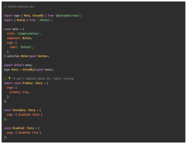
TypeScript is popularly used for JavaScript extension and data specification in the industry. As it reports unmatched types, writing in TypeScript can ensure productivity and optimal developer experience while coding. If we are onto using TypeScript, Storybook 7.0 is worth mentioning. That’s because it allows you to write in TypeScript without any configuration setup and boost your experience with built-in APIs. With the launch of Storybook 7.0, the tool rectified all the pain points in the previous version. Now, you get a combination of CSF 3 and the new TypeScript 4.9+ operator to bolster accuracy and safety. Read on to explore how this combination can make your coding more productive and safer while using the latest Storybook 7.0. Storybook 7.0 — An Introduction to Update 8/18 Storybook 7.0 or update 8/18 is a core upgrade of Storybook focused on better interaction testing and user experience. You get 3.5% more screen space for Canvas with over 196 icons available for complete customizations. By the same token, Storybook 7.0 is more compatible in integrating with Remix, Qwik, and SolidJS. The also features some documentation upgrades such as MDX 2 and simplified import of stories. Lastly, the most exclusive upgrade is the combination of TypeScript 4.9+ and CSF3. Let’s see what makes it a big highlight! What is TypeScript 4.9+? TypeScript 4.9+ is a statically-typed superset of JavaScript that provides additional features such as type annotations, interfaces, and generics. It enables developers to write more maintainable and scalable code by catching potential errors at compile-time rather than runtime. One of the key benefits of using TypeScript with Storybook 7.0 is that it allows developers to specify the expected types of props and events for each component. This ensures that any components that use these props and events are properly typed and provide a clear contract for how they should be used. In addition to these benefits, TypeScript can also improve the documentation and discoverability of UI components in Storybook 7.0. By leveraging TypeScript’s support for JSDoc annotations, developers can document the expected usage of each component and generate API documentation automatically. Look at the difference between TypeScript types in Storybook 6 and Storybook 7.0 below. Combination of CSF3 Syntax and TypeScript 4.9+ In addition to TypeScript 4.9+, the Component Story Format (CSF) also received an upgrade from version CSF 2 to CSF3. The combination of both offer enhanced type safety, better in-editor type checking, and Codemod for easy upgrades. Here are the top elements of this incredible combination! StoryObj Type With the upgrade CSF3, you now get access to the StoryObj type that manipulates stories as objects and infers the type of component props. The feature was still there but the previous story was not so powerful to automatically infer prop types. On the other hand, this new syntax depreciates React-Specific ComponentMeta and ComponentStory using React, Vue, Svelte, and Angular. Check the result with a side-by-side comparison of CSF2 and CSF3 given below satisfies Operator satisfies Operator is the most useful feature of TypeScript 4.9+ for strict type checking. Pair CSF3 with satisfies operator to better type safety and fix unspecified/specified issues. Take a look at the below example where TypeScript is not raising any issue for unspecified label arg. If you use satisfies operator, you can fix that issue as we did below. // Button.stories.tsx import type { Meta, StoryObj } from '@storybook/react'; import { Button } from './Button'; const meta = { title: 'Example/Button', component: Button, } satisfies Meta<typeof Button>; export default meta; type Story = StoryObj<typeof meta>; export const Primary: Story = { args: { primary: true, }, }; After fixing the issue, you can expect TypeScript to provide an error for unspecified arg. Auto-infer Component Level args Pairing the CSF and TypeScript is good but it will not infer the types automatically unless you specify the connection. In this scenario, TypeScript will show errors on the stories even if you have provided a label in meta-level args. That’s where auto-infer component level args come up to specify the connection between CSF and TypeScript. To make them understand the connection, you need to pass the typeof meta to StoryObj at both story and meta-level. Here’s how you can do it! // Button.stories.tsx import type { Meta, StoryObj } from '@storybook/react'; import { Button } from './Button'; const meta = { title: 'Example/Button', component: Button, args: { label: 'Default', }, } satisfies Meta<typeof Button>; export default meta; type Story = StoryObj<typeof meta>; // ???? TS won't complain about the "label" missing export const Primary: Story = { args: { primary: true, }, }; const Secondary: Story = { args: { disabled: false } }; const Disabled: Story = { args: { disabled: true } }; Vue As discussed above, Storybook 7.0 is more compatible with modern frameworks. Vue is the best example of that but you need to set up an ideal environment. Look for SFC files with vue-tsc and access the editor support in VSCode. Take a look at the Vue3 single file component. <script setup lang="ts"> defineProps<{ count: number, disabled: boolean }>() const emit = defineEmits<{ (e: 'increaseBy', amount: number): void; (e: 'decreaseBy', amount: number): void; }>(); </script> <template> <div class="card"> {{ count }} <button @click="emit('increaseBy', 1)" :disabled='disabled'> Increase by 1 </button> <button @click="$emit('decreaseBy', 1)" :disabled='disabled'> Decrease by 1 </button> </div> </template> Svelte Like Vue, Svelte features excellent support for TypeScript and enables .svelte files. You can utilize svelte-check and add VSCode editor support to run type checks. Consider the following component as an example. <script lang="ts"> import { createEventDispatcher } from 'svelte'; export let count: number; export let disabled: boolean; const dispatch = createEventDispatcher(); </script> <div class="card"> {count} <button on:click={() => dispatch('increaseBy', 1)} {disabled}> Increase by 1 </button> <button on:click={() => dispatch('decreaseBy', 1)} {disabled}> Decrease by 1 </button> </div> Conclusion: Conclusively, the new TypeScript 4.9+ features in Storybook 7.0 have greatly improved the type safety and developer experience for creating UI components. With the addition of advanced type inference capabilities, developers can now create reusable components with
Level Up Your React Skills — Top 6 React Design Patterns to Try

Introduction With its incredible capabilities, React has overlapped the old-school CSS, HTML, and JavaScript offering ease of coding. The JavaScript library works with virtual DOM concepts and an exclusive range of developer tools instead of just manipulating the DOM. Developers usually run out of ideas with new concepts and ideas while coding. If you’re one of those looking to revamp your React skills, you must utilize React Design Patterns. Let’s explore them all! 6 Most Useful React Design Patterns to Try Container Components First and foremost, the container components pattern leads the list with its elite diversification functionality. It’s designed to separate data fetching/logic and events from the presentational components. As the presentational components are dumb components, they just render the data fetched and passed by the container component. Take a look at the example displaying the container component pattern for a movie app using React hooks. import { useEffect, useState } from 'react'; import { movies } from '../data/movies'; import './movies.css'; const fetchMovies = () => { return movies; }; const MovieContainer = () => { console.log(fetchMovies()); const [movies, setMovies] = useState([]); useEffect(() => { const movies = fetchMovies(); console.log('MovieContainer: useEffect: movies: ', movies); setMovies(movies); }, []); return( <div className="movie-container"> <h2>Movies</h2> <ul className ="movie-list"> {movies.map(movie => ( <li key={movie.id} className="movie"> <img src={movie.poster} alt={movie.title} /> <p>{movie.title} by {movie.director} was released on {movie.year}</p> <p>Rating: {movie.rating}</p> </li> ))} </ul> </div> ); }; export default MovieContainer; Render Props In addition to conditional components, using render props can also be a great bet if you experience logic repetition. This pattern works with Prop which is equal to a function allowing you to share code between React components. With render props, you can enable a component to toggle visibility and render its content. Take a look at the below example for an expansive view! function Toggle({ children }) { const [isVisible, setIsVisible] = useState(false); function handleClick() { setIsVisible(!isVisible); } return children({ isVisible, toggle: handleClick }); } Conditional Rendering Conditional rendering is an ultimate technique designed to render specific UI components according to certain factors such as user input, component state, and more. If you’re looking to implement a conditional rendering pattern in React, you can do it with the ternary operator, Logical && Operator, and switch statements. Here’s how you can do it! Ternary Operator import React from "react"; function Greeting () { const isLoggedin = 'true' return ( <div> {isLoggedin ? (<h1>Welcome back, User</h1>) : (<h1>please login to continue</h1>)} </div> ) } export default Greeting Logical && Operator function ExampleComponent(props) { const isLoggedIn = props.isLoggedIn; return ( <div> {isLoggedIn && <p>Welcome back, user!</p>} {!isLoggedIn && <p>Please login to continue.</p>} </div> ); } Switch Statements function ExampleComponent(props) { const status = props.status; switch (status) { case "loading": return <LoadingIndicator />; case "error": return <ErrorMessage message={props.errorMessage} />; case "success": return <SuccessMessage message={props.successMessage} />; default: return null; } } Context API If we just dig into the default functionalities, React is set to pass props through every level of the component tree to pass data to a child component. With Context API, you can pass data at any level of the component tree without passing the props. The process to use React Context API starts with creating a context object with the createContext function. After this, it will allow you to use the provider component to take value prop for any type of data. Let’s make it work! import React from 'react'; import ReactDOM from 'react-dom'; import MyContext from './MyContext'; function App() { const data = { name: 'John', age: 30 }; return ( <MyContext.Provider value={data}> <ChildComponent /> </MyContext.Provider> ); } function ChildComponent() { return ( <MyContext.Consumer> {value => ( <div> <p>Name: {value.name}</p> <p>Age: {value.age}</p> </div> )} </MyContext.Consumer> ); } ReactDOM.render(<App />, document.getElementById('root')); HOCs Higher Order Components (HOCs) are JavaScript functions designed to add data and functionality to the component. They enable the reuse of component logic and allow you to share standard functionality between multiple components. Moreover, the best part is the HOC pattern doesn’t require duplicating the code to add functionalities to components. Just create a Hoc.js file with the following code: import React from "react"; const Hoc = (WrappedComponent, entity) => { return class extends React.Component { state = { data: [], term: "", }; componentDidMount() { const fetchData = async () => { const res = await fetch( `https://jsonplaceholder.typicode.com/${entity}` ); const json = await res.json(); this.setState({ …this.state, data: json }); }; fetchData(); } render() { let { term, data } = this.state; let filteredData = data.slice(0, 10).filter((d) => { if (entity === "users") { const { name } = d; return name.indexOf(term) >= 0; } if (entity === "todos") { const { title } = d; return title.indexOf(term) >= 0; } }); return ( <div> <h2>Users List</h2> <div> <input type="text" value={term} onChange={(e) => this.setState({ …this.state, term: e.target.value }) } /> </div> <WrappedComponent data={filteredData}></WrappedComponent> </div> ); } }; }; export default Hoc; Hooks Lastly, you have React Hooks as the most appreciated React Design Patterns. The pattern was introduced with React 16.8 update to enable developers to use React without any classes. Interestingly, you get over 15 pre-built React hooks in the library including Effect Hook and State Hook. Even if you’re looking for a custom hook, you can create your own hook from scratch or just modify the existing one according to your needs. Here we get you an example of using the useState hook known for tracking state in a function component. import { useState } from 'react'; function Counter() { const [count, setCount] = useState(0); return ( <> <p>Count: {count}</p> <button onClick={() => setCount(count + 1)}> Increase </button> </> ); } Conclusion React has emerged as an essential part of today’s web development, offering versatile features that provide developers with an improved coding experience. However, it poses innate challenges while executing practical experiments. Solving these issues involves a great deal of attention and experimentation to understand modern design patterns and frameworks. Utilizing React Design Patterns is a great way to gain more insight into your projects and build cross-platform applications