
How the New TypeScript 4.9+ Streamlines the Type Safety in Storybook 7.0?
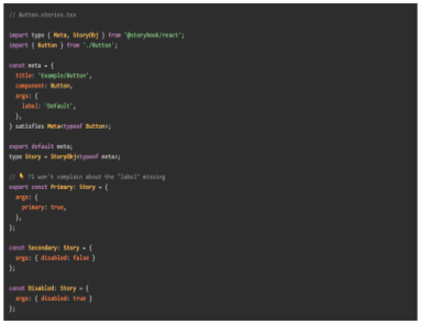
TypeScript is popularly used for JavaScript extension and data specification in the industry. As it reports unmatched types, writing in TypeScript can ensure productivity and optimal developer experience while coding. If we are onto using TypeScript, Storybook 7.0 is worth mentioning. That’s because it allows you to write in TypeScript without any configuration setup and boost your experience with built-in APIs. With the launch of Storybook 7.0, the tool rectified all the pain points in the previous version. Now, you get a combination of CSF 3 and the new TypeScript 4.9+ operator to bolster accuracy and safety. Read on to explore how this combination can make your coding more productive and safer while using the latest Storybook 7.0. Storybook 7.0 — An Introduction to Update 8/18 Storybook 7.0 or update 8/18 is a core upgrade of Storybook focused on better interaction testing and user experience. You get 3.5% more screen space for Canvas with over 196 icons available for complete customizations. By the same token, Storybook 7.0 is more compatible in integrating with Remix, Qwik, and SolidJS. The also features some documentation upgrades such as MDX 2 and simplified import of stories. Lastly, the most exclusive upgrade is the combination of TypeScript 4.9+ and CSF3. Let’s see what makes it a big highlight! What is TypeScript 4.9+? TypeScript 4.9+ is a statically-typed superset of JavaScript that provides additional features such as type annotations, interfaces, and generics. It enables developers to write more maintainable and scalable code by catching potential errors at compile-time rather than runtime. One of the key benefits of using TypeScript with Storybook 7.0 is that it allows developers to specify the expected types of props and events for each component. This ensures that any components that use these props and events are properly typed and provide a clear contract for how they should be used. In addition to these benefits, TypeScript can also improve the documentation and discoverability of UI components in Storybook 7.0. By leveraging TypeScript’s support for JSDoc annotations, developers can document the expected usage of each component and generate API documentation automatically. Look at the difference between TypeScript types in Storybook 6 and Storybook 7.0 below. Combination of CSF3 Syntax and TypeScript 4.9+ In addition to TypeScript 4.9+, the Component Story Format (CSF) also received an upgrade from version CSF 2 to CSF3. The combination of both offer enhanced type safety, better in-editor type checking, and Codemod for easy upgrades. Here are the top elements of this incredible combination! StoryObj Type With the upgrade CSF3, you now get access to the StoryObj type that manipulates stories as objects and infers the type of component props. The feature was still there but the previous story was not so powerful to automatically infer prop types. On the other hand, this new syntax depreciates React-Specific ComponentMeta and ComponentStory using React, Vue, Svelte, and Angular. Check the result with a side-by-side comparison of CSF2 and CSF3 given below satisfies Operator satisfies Operator is the most useful feature of TypeScript 4.9+ for strict type checking. Pair CSF3 with satisfies operator to better type safety and fix unspecified/specified issues. Take a look at the below example where TypeScript is not raising any issue for unspecified label arg. If you use satisfies operator, you can fix that issue as we did below. // Button.stories.tsx import type { Meta, StoryObj } from '@storybook/react'; import { Button } from './Button'; const meta = { title: 'Example/Button', component: Button, } satisfies Meta<typeof Button>; export default meta; type Story = StoryObj<typeof meta>; export const Primary: Story = { args: { primary: true, }, }; After fixing the issue, you can expect TypeScript to provide an error for unspecified arg. Auto-infer Component Level args Pairing the CSF and TypeScript is good but it will not infer the types automatically unless you specify the connection. In this scenario, TypeScript will show errors on the stories even if you have provided a label in meta-level args. That’s where auto-infer component level args come up to specify the connection between CSF and TypeScript. To make them understand the connection, you need to pass the typeof meta to StoryObj at both story and meta-level. Here’s how you can do it! // Button.stories.tsx import type { Meta, StoryObj } from '@storybook/react'; import { Button } from './Button'; const meta = { title: 'Example/Button', component: Button, args: { label: 'Default', }, } satisfies Meta<typeof Button>; export default meta; type Story = StoryObj<typeof meta>; // ???? TS won't complain about the "label" missing export const Primary: Story = { args: { primary: true, }, }; const Secondary: Story = { args: { disabled: false } }; const Disabled: Story = { args: { disabled: true } }; Vue As discussed above, Storybook 7.0 is more compatible with modern frameworks. Vue is the best example of that but you need to set up an ideal environment. Look for SFC files with vue-tsc and access the editor support in VSCode. Take a look at the Vue3 single file component. <script setup lang="ts"> defineProps<{ count: number, disabled: boolean }>() const emit = defineEmits<{ (e: 'increaseBy', amount: number): void; (e: 'decreaseBy', amount: number): void; }>(); </script> <template> <div class="card"> {{ count }} <button @click="emit('increaseBy', 1)" :disabled='disabled'> Increase by 1 </button> <button @click="$emit('decreaseBy', 1)" :disabled='disabled'> Decrease by 1 </button> </div> </template> Svelte Like Vue, Svelte features excellent support for TypeScript and enables .svelte files. You can utilize svelte-check and add VSCode editor support to run type checks. Consider the following component as an example. <script lang="ts"> import { createEventDispatcher } from 'svelte'; export let count: number; export let disabled: boolean; const dispatch = createEventDispatcher(); </script> <div class="card"> {count} <button on:click={() => dispatch('increaseBy', 1)} {disabled}> Increase by 1 </button> <button on:click={() => dispatch('decreaseBy', 1)} {disabled}> Decrease by 1 </button> </div> Conclusion: Conclusively, the new TypeScript 4.9+ features in Storybook 7.0 have greatly improved the type safety and developer experience for creating UI components. With the addition of advanced type inference capabilities, developers can now create reusable components with
Level Up Your React Skills — Top 6 React Design Patterns to Try

Introduction With its incredible capabilities, React has overlapped the old-school CSS, HTML, and JavaScript offering ease of coding. The JavaScript library works with virtual DOM concepts and an exclusive range of developer tools instead of just manipulating the DOM. Developers usually run out of ideas with new concepts and ideas while coding. If you’re one of those looking to revamp your React skills, you must utilize React Design Patterns. Let’s explore them all! 6 Most Useful React Design Patterns to Try Container Components First and foremost, the container components pattern leads the list with its elite diversification functionality. It’s designed to separate data fetching/logic and events from the presentational components. As the presentational components are dumb components, they just render the data fetched and passed by the container component. Take a look at the example displaying the container component pattern for a movie app using React hooks. import { useEffect, useState } from 'react'; import { movies } from '../data/movies'; import './movies.css'; const fetchMovies = () => { return movies; }; const MovieContainer = () => { console.log(fetchMovies()); const [movies, setMovies] = useState([]); useEffect(() => { const movies = fetchMovies(); console.log('MovieContainer: useEffect: movies: ', movies); setMovies(movies); }, []); return( <div className="movie-container"> <h2>Movies</h2> <ul className ="movie-list"> {movies.map(movie => ( <li key={movie.id} className="movie"> <img src={movie.poster} alt={movie.title} /> <p>{movie.title} by {movie.director} was released on {movie.year}</p> <p>Rating: {movie.rating}</p> </li> ))} </ul> </div> ); }; export default MovieContainer; Render Props In addition to conditional components, using render props can also be a great bet if you experience logic repetition. This pattern works with Prop which is equal to a function allowing you to share code between React components. With render props, you can enable a component to toggle visibility and render its content. Take a look at the below example for an expansive view! function Toggle({ children }) { const [isVisible, setIsVisible] = useState(false); function handleClick() { setIsVisible(!isVisible); } return children({ isVisible, toggle: handleClick }); } Conditional Rendering Conditional rendering is an ultimate technique designed to render specific UI components according to certain factors such as user input, component state, and more. If you’re looking to implement a conditional rendering pattern in React, you can do it with the ternary operator, Logical && Operator, and switch statements. Here’s how you can do it! Ternary Operator import React from "react"; function Greeting () { const isLoggedin = 'true' return ( <div> {isLoggedin ? (<h1>Welcome back, User</h1>) : (<h1>please login to continue</h1>)} </div> ) } export default Greeting Logical && Operator function ExampleComponent(props) { const isLoggedIn = props.isLoggedIn; return ( <div> {isLoggedIn && <p>Welcome back, user!</p>} {!isLoggedIn && <p>Please login to continue.</p>} </div> ); } Switch Statements function ExampleComponent(props) { const status = props.status; switch (status) { case "loading": return <LoadingIndicator />; case "error": return <ErrorMessage message={props.errorMessage} />; case "success": return <SuccessMessage message={props.successMessage} />; default: return null; } } Context API If we just dig into the default functionalities, React is set to pass props through every level of the component tree to pass data to a child component. With Context API, you can pass data at any level of the component tree without passing the props. The process to use React Context API starts with creating a context object with the createContext function. After this, it will allow you to use the provider component to take value prop for any type of data. Let’s make it work! import React from 'react'; import ReactDOM from 'react-dom'; import MyContext from './MyContext'; function App() { const data = { name: 'John', age: 30 }; return ( <MyContext.Provider value={data}> <ChildComponent /> </MyContext.Provider> ); } function ChildComponent() { return ( <MyContext.Consumer> {value => ( <div> <p>Name: {value.name}</p> <p>Age: {value.age}</p> </div> )} </MyContext.Consumer> ); } ReactDOM.render(<App />, document.getElementById('root')); HOCs Higher Order Components (HOCs) are JavaScript functions designed to add data and functionality to the component. They enable the reuse of component logic and allow you to share standard functionality between multiple components. Moreover, the best part is the HOC pattern doesn’t require duplicating the code to add functionalities to components. Just create a Hoc.js file with the following code: import React from "react"; const Hoc = (WrappedComponent, entity) => { return class extends React.Component { state = { data: [], term: "", }; componentDidMount() { const fetchData = async () => { const res = await fetch( `https://jsonplaceholder.typicode.com/${entity}` ); const json = await res.json(); this.setState({ …this.state, data: json }); }; fetchData(); } render() { let { term, data } = this.state; let filteredData = data.slice(0, 10).filter((d) => { if (entity === "users") { const { name } = d; return name.indexOf(term) >= 0; } if (entity === "todos") { const { title } = d; return title.indexOf(term) >= 0; } }); return ( <div> <h2>Users List</h2> <div> <input type="text" value={term} onChange={(e) => this.setState({ …this.state, term: e.target.value }) } /> </div> <WrappedComponent data={filteredData}></WrappedComponent> </div> ); } }; }; export default Hoc; Hooks Lastly, you have React Hooks as the most appreciated React Design Patterns. The pattern was introduced with React 16.8 update to enable developers to use React without any classes. Interestingly, you get over 15 pre-built React hooks in the library including Effect Hook and State Hook. Even if you’re looking for a custom hook, you can create your own hook from scratch or just modify the existing one according to your needs. Here we get you an example of using the useState hook known for tracking state in a function component. import { useState } from 'react'; function Counter() { const [count, setCount] = useState(0); return ( <> <p>Count: {count}</p> <button onClick={() => setCount(count + 1)}> Increase </button> </> ); } Conclusion React has emerged as an essential part of today’s web development, offering versatile features that provide developers with an improved coding experience. However, it poses innate challenges while executing practical experiments. Solving these issues involves a great deal of attention and experimentation to understand modern design patterns and frameworks. Utilizing React Design Patterns is a great way to gain more insight into your projects and build cross-platform applications